Best Website Builder
I test every website builder so you don’t have to. These are my rankings of the best website builders in 2025.
Our work is supported by affiliate commissions. Learn More
By Steve Benjamins | Fact checked by Juhil Mendpara | Updated Apr 16 2025
Wix and Squarespace are the two biggest website builders—and it’s not even close. Together they power 55% of websites that are built with a website builder.
But while they’re both popular, they also have stark differences. It’s almost like Mac vs PC— Squarespace is curated and design-y while Wix is occasionally chaotic but allows for a lot of freedom to customize.
I recommend Squarespace over Wix, but it’s important to understand the differences, and that’s what this article will explain.
Wix and Squarespace combined are 55% of the website builder market— significantly more than any other company.
Their differences are almost like Mac vs PC: Squarespace is curated and design-y while Wix is occasionally chaotic but allows for a lot of freedom to customize.
Wix is an unstructured editor where you drag elements anywhere on a page. Squarespace is a structured editor where elements snap into columns and rows.
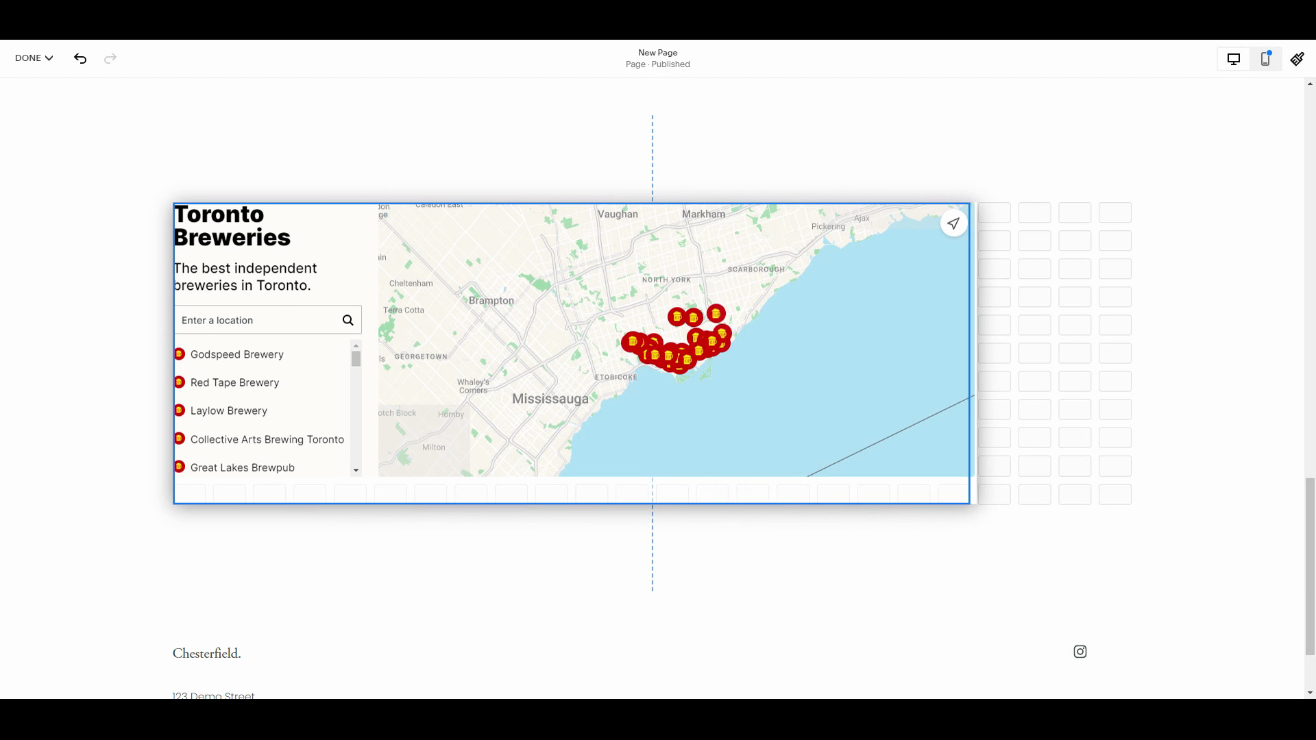
There are core features that every website builder just needs to have: photo galleries, maps, forms, audio players— that kind of thing. Both Wix and Squarespace have these covered. (Wix may have a slight edge in the amount of features.)
Wix has more templates than Squarespace but Squarespace has better templates. This isn't necessarily a knock on Wix's templates as Squarespace has the best templates of any website builder.
The biggest difference between Wix and Squarespace is the page editor.
Wix has a highly customizable, unstructured editor. Whereas Squarespace’s editor is structured and easy to use.
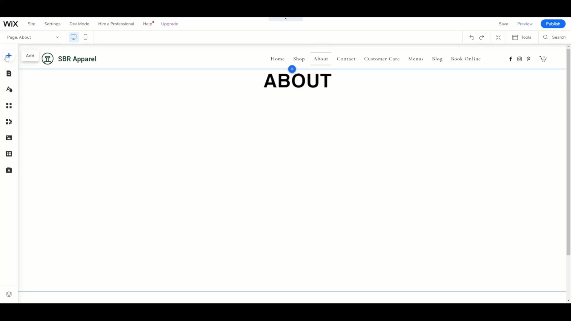
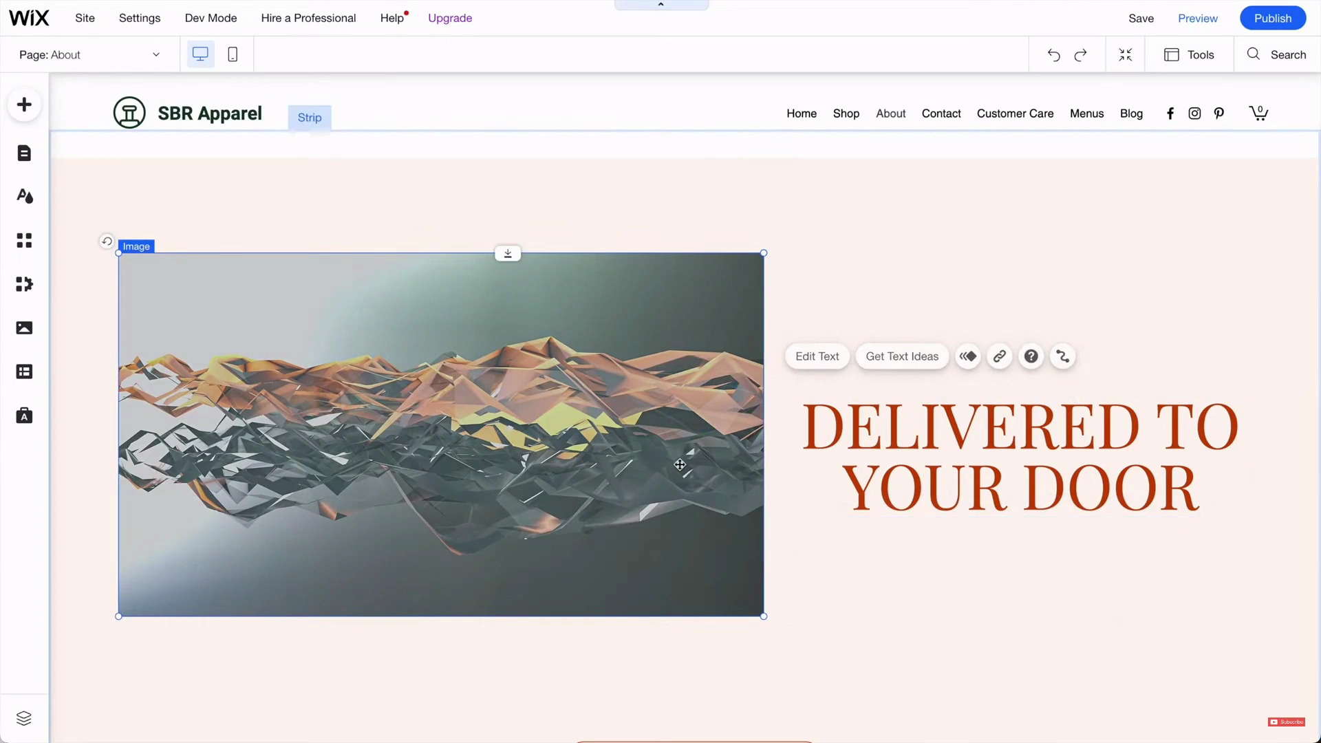
With Wix, you can move any element anywhere on your page—even by one pixel if you want. It’s an unstructured editor.
Being able to drag and drop elements anywhere on a page feels freeing on paper. However, it can (and often does) lead to frustrating problems, especially for non-designers.
Here’s a simple example showcasing a typical scenario:

We added three sections, removed the middle one, and switched the position of the first and third. Notice the difficulties and inconsistencies in both the desktop version and the mobile version.
These are some major and minor frustrations you’ll see in the minute-something video of us using the Wix editor:
Besides, Wix gives almost too many options:

Icons and buttons on the Wix editor.
Overall: Giving someone Wix is like giving someone a blank canvas with all the colors, the paintbrushes, and all other painting supplies. If that someone is a web designer/painter, the result will be a great website/painting. But that much open-endedness is a lot of responsibility to hand off to a user not quite adept at web designing/painting.
Squarespace doesn’t run into the same problems—because Squarespace has a structured editor, and it’s among the easiest to use.
In Squarespace, you can’t move an element anywhere on a page. Instead, Squarespace’s Fluid Engine editor only allows you to drag elements (called Content Blocks) into rows and columns of a section. It’s still a visual, drag-and-drop editor; it’s still very customizable — but there’s an inherent and sensible structure that you stay within.
Let’s try to make the same simple web page we made with Wix with Squarespace:

Notice how you don’t face the same problems you’d face with Wix. Also, notice the intuitiveness of the Squarespace editor!
Overall, we recommend Squarespace’s structured page editor over Wix’s unstructured page editor.
Wix’s unstructured editor may give you more flexibility, but it introduces a cascade of knock-on problems—such as having to make the same edit twice.
In terms of volume, Wix has significantly more templates than Squarespace: Wix has 900+ templates, and Squarespace has 160+ templates. But you need just one template at the end of the day, and Squarespace’s templates are better!
Squarespace has the best templates of any website builder. This is subjective to a degree, but honestly, there’s no other website builder that matches Squarespace’s clean, modern templates:

The 'Noll' template.

The 'Beaumont' template.

The ‘Carmine’ template.

The ‘Clune’ template.
These are the last three templates on Squarespace’s ‘All Templates’ page:

Wix’s best templates aren’t quite as nice as Squarespace, and their worst templates can be…corny and dated.

Wix template example — beautiful.

Another Wix example template — it’s quite good.

Another example Wix template— though this one feels pretty outdated.
One primary reason behind Wix’s always-increasing number of templates is that Wix never deletes its outdated templates (Squarespace does). Therefore, not all Wix templates are good.
For example, these are the templates from the last page of Wix’s “All Templates” category:

Almost all templates are outdated.
They all look from the early 2010s because they likely are!
Moreover, many of the new templates just add to the “number of templates” factor but aren’t actually notable. For example, half of the newest 12 templates are just “coming soon landing page” templates:

Note: In both Wix and Squarespace, you can’t switch your template once you’ve chosen it.
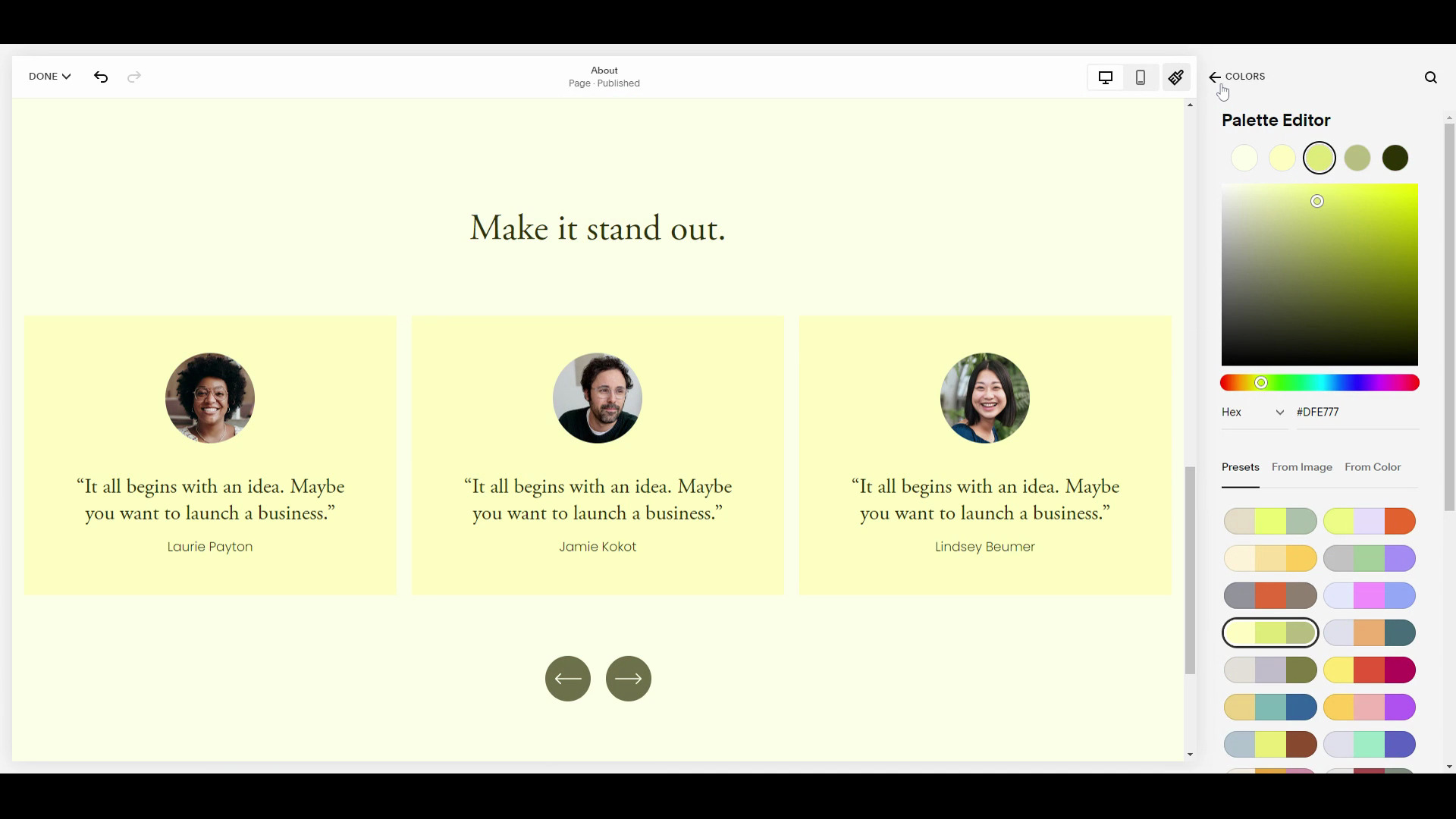
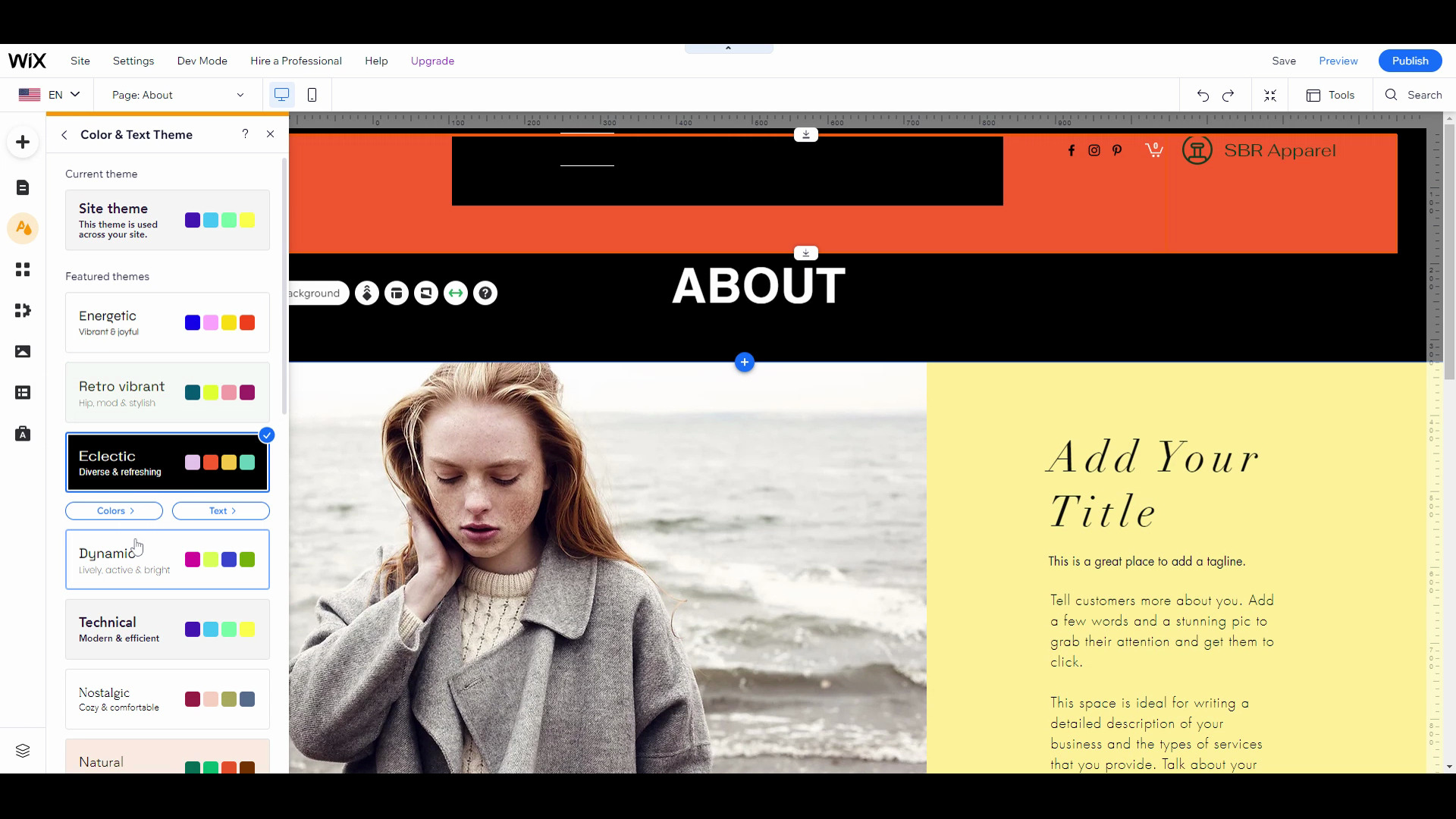
Squarespace also has better template customization. For example, it’s much easier to apply your brand colors consistently. Basically, you choose a palette that then applies throughout your website. If you want to get more specific and choose colors for individual elements, you can do that too. Here’s how it works:

Applying a new color palette with Squarespace.
Frankly it’s confusing and difficult to do this with Wix. You can technically sort of do it…. but it’s just way, way more complicated. I would be very surprised if many users took advantage of this complicated system:

Applying a new color palette with Wix. Notice how the About section doesn’t change with the sitewide palette change.
There are core features that every website builder just needs to have—for example:
Both Wix and Squarespace have these core features covered.
In recent years both Squarespace and Wix have aggressively moved beyond websites and into online presence—each launching their own online booking features, ecommerce, and email marketing.
It’s really only when you move beyond these core features that the differences become clearer. Overall, I would characterize it like this: Wix has more features, but Squarespace tends to do a better job of features.
For example, below is a list of features that Wix supports out of the box (you have to add them from the App Market, though). The only way to get these features with Squarespace would be to integrate with a 3rd party provider or custom code.
| FEATURE | WIX | SQUARESPACE |
|---|---|---|
| Forum | With Wix Forum app. | Requires integration with Muut. |
| Live Chat | With Wix Live Chat app. | Requires integration with a 3rd party provider such as Tawk. |
| Multilingual site | With Wix Multilingual app | Required integration with WeGlot |
| Third-Party Fonts | Add directly from the editor | Need CSS code |
Then there are features that Wix supports and Squarespace simply doesn’t. Some examples:
Important Note: All the Wix apps are labeled “free to install” on the Wix App Market. It’s true, but most of them have paid versions, and Wix doesn’t mention the pricing on the app landing page.
Also worth noting: Wix’s app store (Wix App Market) is superior to Squarespace’s app store (Squarespace Extensions). You can install 500+ web apps from the Wix App Market compared to 30-something on Squarespace Extensions.
Squarespace may not match Wix on every feature, but they often do a better job at the features that they do match.
Here are some examples.
Here is what editing a restaurant menu looks like on Wix— watch how many clicks it takes to edit one item:

Spoiler! It takes 10 clicks
That’s just takes way too long.
I’m sympathetic to Wix— restaurant menus are deceptively hard to format for websites. It’s why many restaurants just link to a PDF menu. But this also shows you how much more thoughtful Squarespace’s restaurant menu editor is.
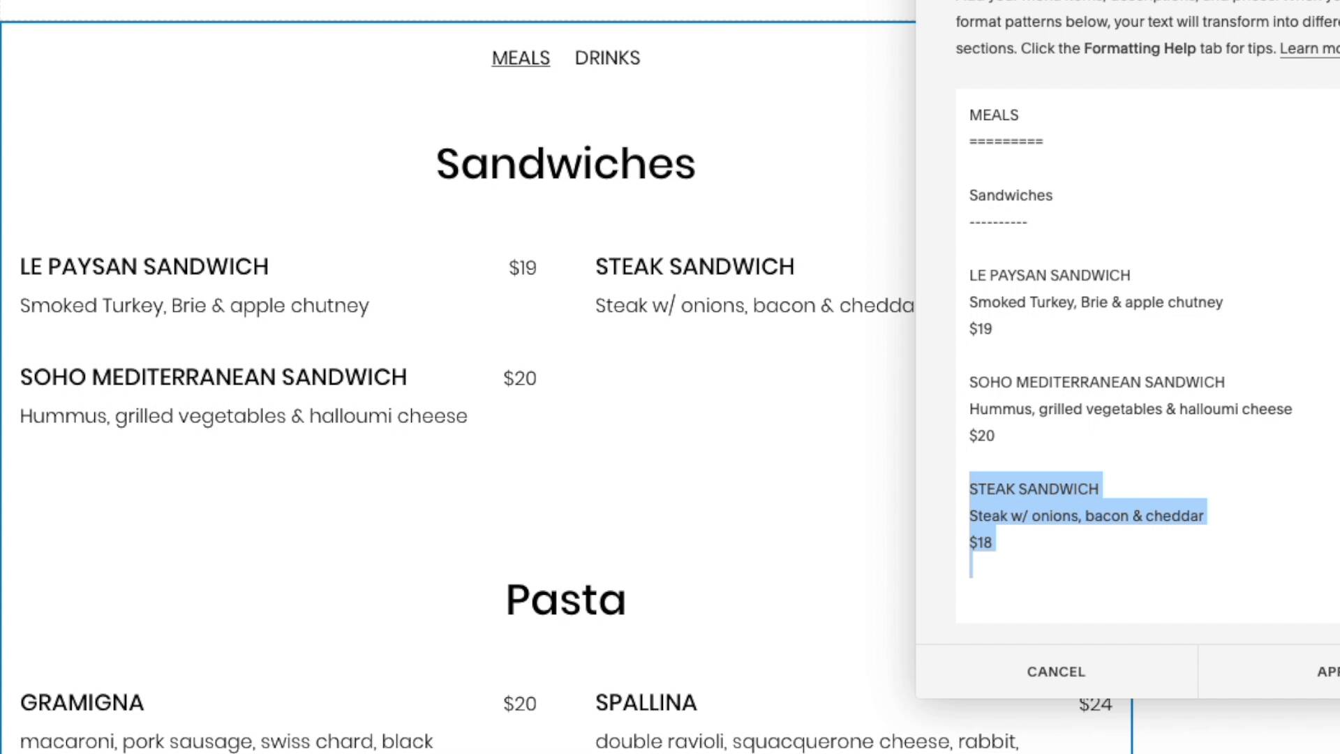
For restaurant menus, Squarespace invented a simple markup language. You follow the formatting patterns and can write your menu in real time. It’s really clever and intuitive:

For restaurant menus, Squarespace invented a simple markup language— you follow the formatting patterns and write your menu in real-time.
Much easier, right?
2. Ecommerce Donations
Another example of Squarespace doing a better job of features is donations.
Wix can technically accept donations, but it’s just a basic donation button that sends visitors to Paypal. It is not a full donation system.
Squarespace, on the other hand, has an excellent, fully-featured donation system— it’s much better:
| FEATURE | SQUARESPACE | WIX |
|---|---|---|
| Donor Specific Checkout | Yes | No |
| Donor Email Receipts | Yes | No |
| Suggested Amounts | Yes | No |
I used to work for a non-profit, and these three features are critical. You don’t want donors to have an ecommerce experience, and you’ll find suggested amounts on every major non-profit— it’s a best practice.

Setting a suggested amount for donations.
3. Podcasts
Finally, here’s one last example: podcasts.
Wix offers a Podcast Player, but it doesn’t syndicate podcasts. Syndicating is critical to a podcast website—it’s what allows you to submit your podcast to Apple Podcasts and Spotify.
Squarespace is the only website builder that can syndicate podcasts. It’s another example of Squarespace taking the time to get a feature right.
Similarly, Wix doesn’t have many other features required to make a good podcast website. Wix user Jessjoyce lists a few of them in an app review:

Jessjoyce writes: “VERY simple podcast player, doesn't allow for each episode to have its own page (what!) nor modify where the sharing buttons are or add in transcripts or links within the content.”
Tip: Both Squarespace and Wix integrate with Zapier— and you’ll want to take advantage of this. Zapier let’s you create automations based on visitor activity. So for example, you could tell Zapier to send you a text message or create a new Trello card every time someone fills out a form. It’s a very handy way to create features unique to you.
Squarespace doesn’t have as many features as Wix. But the ones it does have are well-thought-out and plenty for most users (from artists to accountants and service businesses to ecommerce).
Wix’s features are also great and worth considering…if a feature you need isn’t available on Squarespace (many aren’t — even some important ones!).
Wix and Squarespace have both aggressively built ecommerce features over the last few years. We have compared both with Shopify - the best overall ecommerce builder, and both fared quite well. Squarespace was a bit better in some important aspects, though.
Both cover the fundamentals of a store (inventory management, discounts, product variations, taxes, etc.) and also have advanced features too:
| FEATURE | SQUARESPACE | WIX |
|---|---|---|
| Digital Products | Yes | Yes |
| Custom Email Receipts | Yes | Yes |
| Connect To Print On Demand Services | Yes | Yes |
| Point Of Sale System | Yes | Yes |
| Instagram Shop Tagging | Yes | Yes |
| Automated Cart Recovery | Yes | Yes |
| Recurring Payment Products | Yes | Yes |
| Gift Cards | Yes | Yes |
| Back In Stock Notifications | Yes | Yes |
| Low Stock Notifications | Yes | Yes |
But I’ve also found Squarespace tends to build more sophisticated features.
For example, Squarespace lets you add sophisticated forms to products— so that you can ask for additional information when a customer checks out. You can choose from a variety of field types: dates, radio buttons, phone numbers, text fields, file uploads, and more:

Squarespace let's you attach sophisticated forms to certain producst.
Wix technically let’s you add form fields to products— but you can only add text fields:

Wix has more limited form builder attached to products.
Similarly, Squarespace’s inventory management, shipping, tax settings, product editor (that includes its whole page editor for additional information), and more are better than Wix. Learn more here.
Both Squarespace and Wix cover the core features needed for small stores. But Squarespace’s ecommerce features are more sophisticated than Wix.
Squarespace has the best blogging of any website builder. If the primary purpose of your site is blogging, just use Squarespace.
Both Wix and Squarespace support fundamental blogging features:
But beyond these core features, Squarespace goes a step further:

Squarespace's blog editor.

Wix blog editor
You’ll find core blogging features on both Squarespace and Wix. But Squarespace blogs look more beautiful because of the superior blog editor.
Fun fact: Squarespace started as a blogging platform!
Squarespace and Wix both have mobile apps for android and iOS devices. And boths’ apps do a solid job of allowing you to handle your website/business from your phone!

Wix mobile app screens
The Wix mobile app lets you see reports and analytics, chat live with visitors, create and send email campaigns, create and share social media posts, manage your blog, and manage your online store.
However, you can’t build web pages through it because Wix has an unstructured editor.

Squarespace mobile app screens
The Squarespace app allows you to create content, manage your store, and grow your business anytime, anywhere (as long you have a smartphone and internet connection, of course). You can do almost anything with it — including editing your whole website (because of its structured editor), adding products, checking analytics, keeping an eye on inventory, adding SEO descriptions, and more.
Note: I found the Squarespace app a bit buggy last year, but new updates have removed the bugs.
Squarespace and Wix give access to pretty much all native website builder features through their mobile apps. However, Wix doesn’t (and can’t) allow building web pages from its app — Squarespace does! So another point to Squarespace.
Wix and Squarespace are (the top two!) closed website-building platforms. This means both companies take care of everything, including security and maintenance of the platform and sites on it.
And they do a fabulous job by employing all these security features:
The two top closed platforms ensure a high degree of security for their users!
A few notes to help you compare pricing plans:
Overall, Squarespace is cheaper than Wix.
The cheapest Wix plan Light costs $17/month (annually), and the cheapest Squarespace plan Personal costs $16/month. However, Wix doesn’t offer as much as Squarespace in the cheapest plan (more on it below). Plus, Squarespace’s most expensive plan is just $99/month compared to Wix’s $159/month plan.

Wix Plans & Pricing

Squarespace Plans & Pricing
It’s common for website builders to advertise their annual plan at a per-month cost. Which doesn’t make sense. You aren’t paying $16/month. You’re actually paying $192/year.
Squarespace at least makes this clear on their pricing page:

Even though Squarespace advertises their annual plans as a per-month cost, at least this toggle shows you the difference.
Wix does not make this clear at all (!) on their pricing page. They don’t even mention that the showcased prices are for the annual plan in the fine print of the pricing page (screenshot of the pricing page)! It’s only when you make a website and try to upgrade it, you find out that the showcased pricing is for the annual plan; even then, the mention is in the fine print:

The fine print reads "Displayed prices are for yearly subscriptions, paid in full at the time of purchase."
So just remember that when you are comparing prices!
Wix’s lower-tier plans have storage limits. In comparison, Squarespace included unlimited storage and bandwidth with each plan.

Wix storage limits
Overall, Squarespace is cheaper and a better value for money than Wix, especially for beginners.
In the end, I recommend Squarespace over Wix. Here’s how I would summarize:
It’s worth mentioning that this doesn’t mean Wix is bad. It’s more about how good Squarespace is. There are plenty of worse options than Wix.
And ultimately, the difference could be about preference: Wix’s unstructured editor offers a high degree of control, while Squarespace is much more curated.
I hope you found this helpful— thanks for reading!
I recommend Squarespace over Wix. Squarespace has a better page editor, better templates, and better pricing. Wix has more features.
Squarespace. Wix has an unstructured editor that allows for more freedom but is occasionally chaotic and overwhelming. Squarespace has a structured editor that is less flexible but more intuitive. We rank Squarespace as the easiest website builder.
Squarespace is cheaper than Wix.
