Best Website Builder
I test every website builder so you don’t have to. These are my rankings of the best website builders in 2025.
Our work is supported by affiliate commissions. Learn More
By Steve Benjamins | Updated Jan 3 2025
Your restaurant’s website matters more than ever in the age of delivery apps like Uber Eats and Door Dash.
Here’s why:
Delivery apps can be a short-term boost but the best long term strategy for restaurants is to own the relationship with customers.
And a website is still the best way to do that on the internet.
Throughout this article I’ll show you how I used Squarespace to build a website for my favourite pizzeria in Toronto: Pizzeria Libretto:

The website I made for Pizzeria Libretto.
I’ve built websites with lots of different website builders— Wix, Wordpress, Weebly, Webflow— but Squarespace is the one I most recommend for restaurants. Here are five reasons why:
Read on even if you don’t plan to use Squarespace— there will still be lots of helpful information!
If you come away with one thing from this article let it be this: websites are functional. They help customers accomplish something. So always make sure your call-to-actions are clear and obvious.
Reservations are important for Pizzeria Libretto so I made the cta really obvious with a big button in the navigation:

A big button makes it obvious how to make a reservation.
Delivery is important too so I put a big, obvious link on the homepage and included a link in the navigation:

Making it obvious how to order delivery.
Finally I put Pizzeria Libretto’s phone number in the footer of the website (as well as in the locations page):

Phone numbers in the footer.
Make it clear where to find your phone number, address and hours of operation.
Sometimes restaurants place this information under a Contact Us page or a Directions page but I think the best name for this page is Locations.
When in doubt, it doesn’t hurt to throw your phone number and address in the footer:

It doesn't hurt to put your phone number and address in the footer.
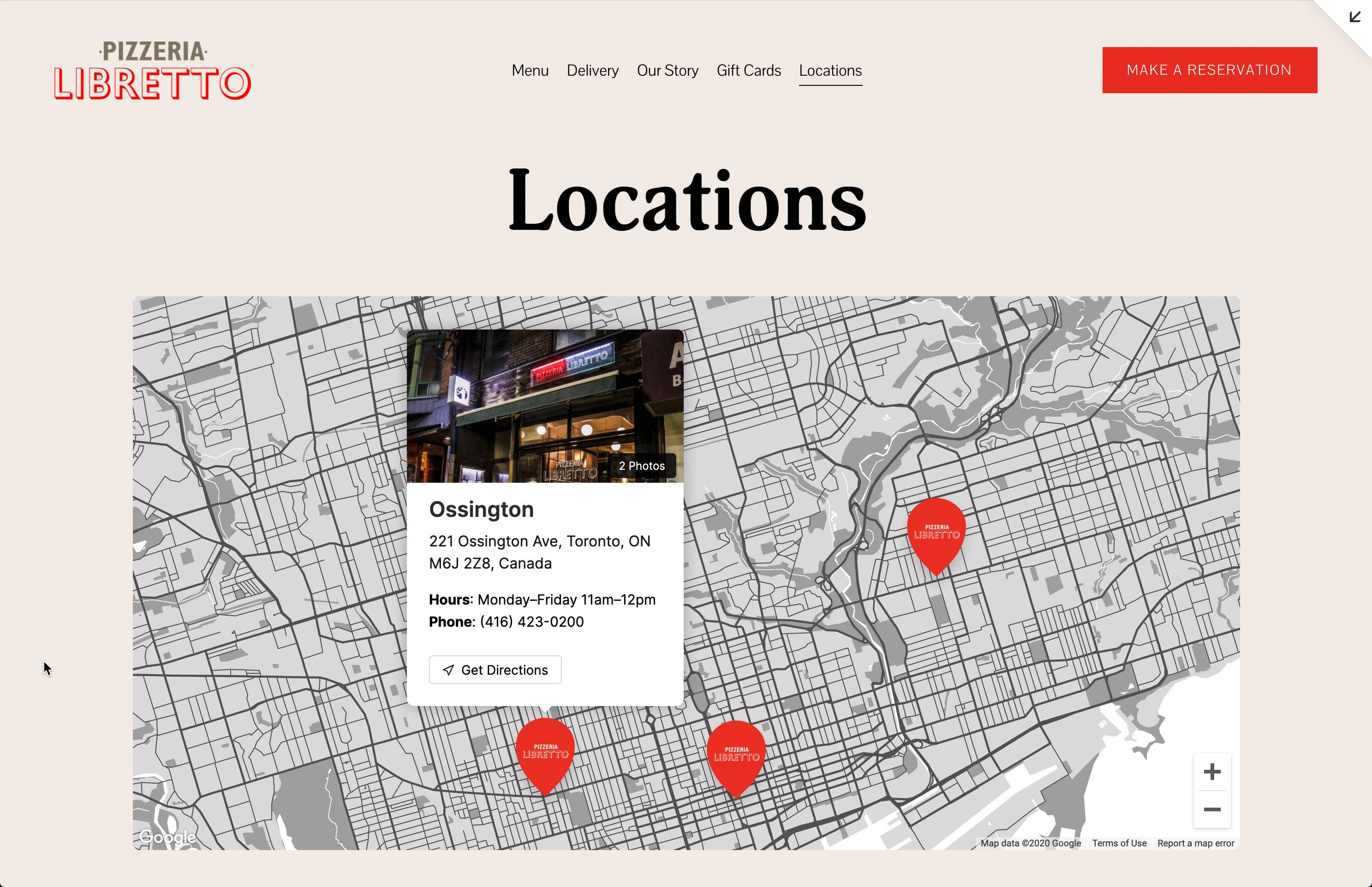
I’d also like to nominate a few “nice to haves” for the Locations page:

The Locations page I created for Pizzeria Libretto.
It’s 2020— you need up-to-date information on Covid-19.
I used Squarespace’s announcement bar for this to link to a Covid-19 page:

Squarespace's 'Announcement Bar' works well for notifying guests about Covid-19 guidelines.
Here are some tips for writing this page:
Momofoku is an example of a restaurant that does this really well.
Let’s talk about the most common way restaurant websites fail: branding.
Branding is really important— especially for independant restaurants. BUT branding has to be in the right place. And since websites are functional we never want branding to be at the expense of usability.
Sorry to be mean but this is not an ideal way to brand a website:

The paintings are cool but confusing. You would think you could click the text but you can't. Instead you navigate by clicking the portraits below the text. There is a hover animation on the portraits that suggests they are links but mobile users don't have hover— so that's completely lost on them.
… And neither is this:

Since Richmond Station sounds like a subway stop, they actually made their menu a subway map which is supposed to be clever but mostly it's just annoying. You have to hover each menu item to see what it holds and you can never see them all visible at once.
Don’t make visitors think. Keep things clear and obvious.
So where can you express your brand? The best spots are typography, photography, color and occasionally, in the language you use.
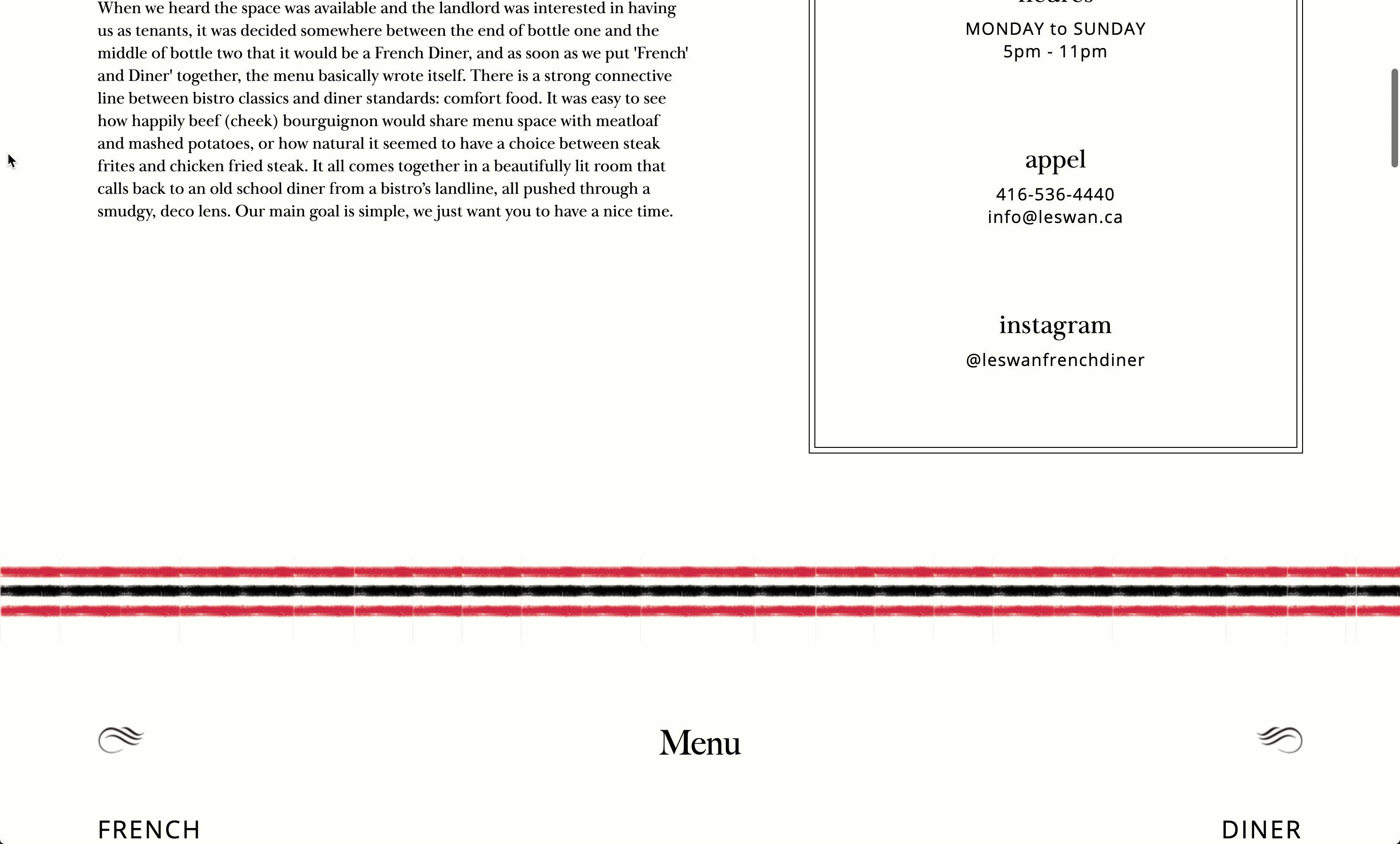
A really wonderful example of branding is Le Swan, a french diner here in Toronto:

The typography and images are so on point. They communicate a vibe. They even manage to use little language flourishes to communicate branding "Reservations Oui" but that language doesn't get in the way of usability.
Color is a great way to communicate brand. For example, bright colors for an organic juice bar or dark colors for a sophisticated steakhouse.
Le Swan is a great example of using brand colors— a very subtle gray-green in the background and splashes of red:

Le Swan is a great example of colors.
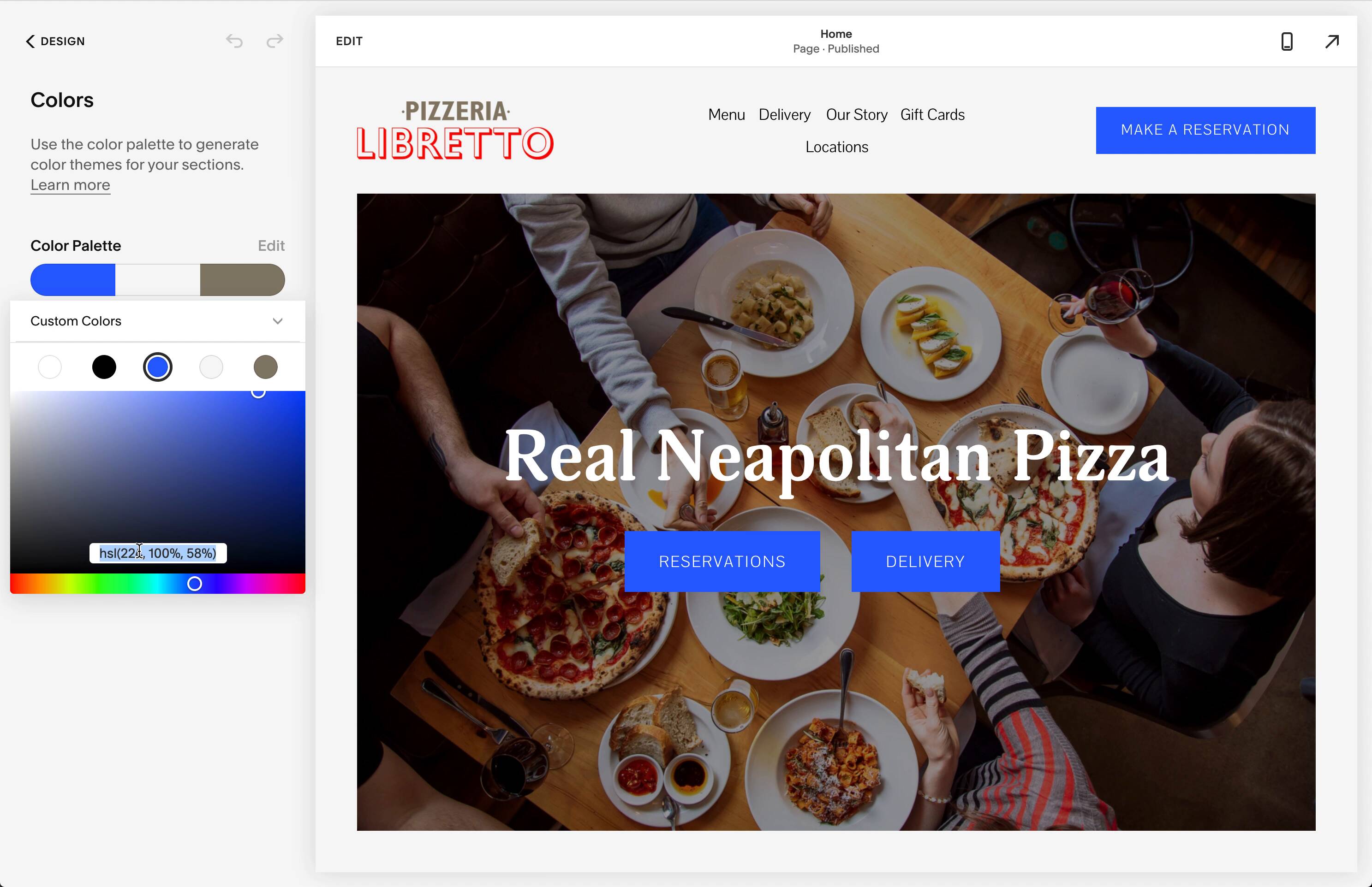
One thing I love about Squarespace is it’s really easy to implement brand colors. All you have to do can edit the color palette— this took me two minutes for Pizzeria Libretto:

Adding Pizzeria Libretto's brand colors.
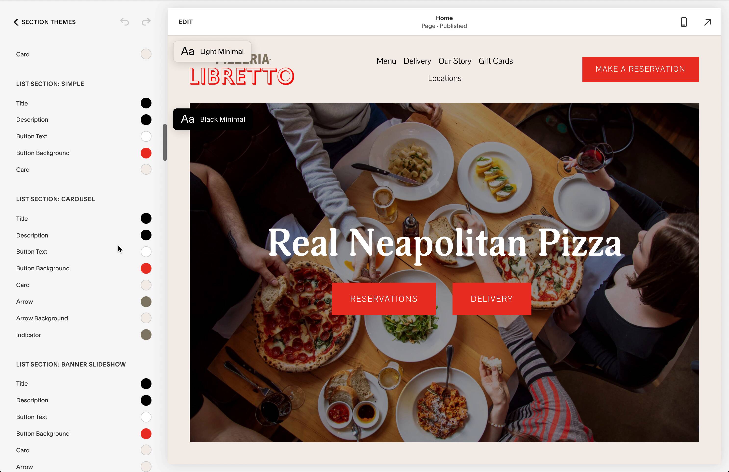
What makes Squarespace especially good is that you don’t have to go any further than this screen BUT if you’d like to, their Style Editor let’s you customize the style of any element.

The \*Style Editor\* let's you customize the style of any element.
Now of course the most important part of branding is photography.
There’s a whole art and science behind food photography— but I’m not an expert in it. I do know a few tips though:
Make things feel abundant:

Make things feel abundant.
Don’t use flash:

Don't use flash!
It’s okay to have some of the prop outside of the frame

It's okay to have part of the prop out of frame.
Using the correct angle is key:

The correct angle is important— for example, side profile for a burger.
To learn more about food photography I’d suggest an awesome Youtube channel called The Bite Shot.
Try not to obscure your photos like this…

Instead if you have great photos, showcase them!
Like this…

… Or like this:

Also photography should highlight whatever is unique about your restaurant. So try to avoid photos that look like stock photos of generic restaurants.

This photo could be ANY bar in the world.
Let’s talk about some “nice to haves.” Things that you don’t necessarily need on your website but that you might want.
There are a lot of people who count calories and they’re all potential customers. Even if you serve high calorie food— people counting calories may still want to know.
This helps customers know what to to expect— is this fine dining? is it takeout? if it is takeout, is seating available? Exterior photos can also show customers what to look for when they’re driving in.
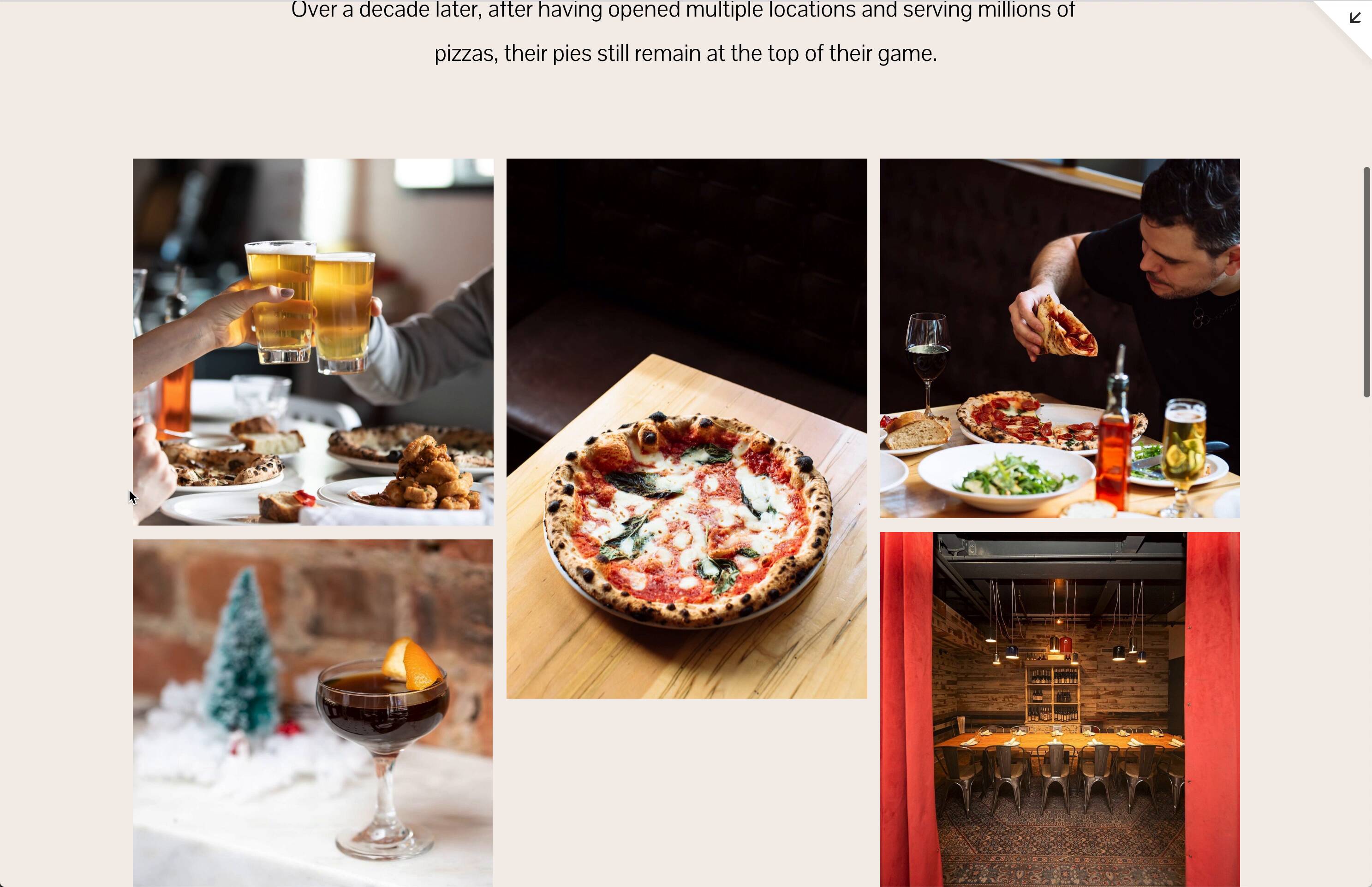
Of course you can tell your story but be judicious. And short. Brevity is important. For Pizzeria Libretto I kept it pretty simple. Try to be honest with yourself about whether or not you have a compelling story.

The 'Our Story' section for Pizzeria Libretto.
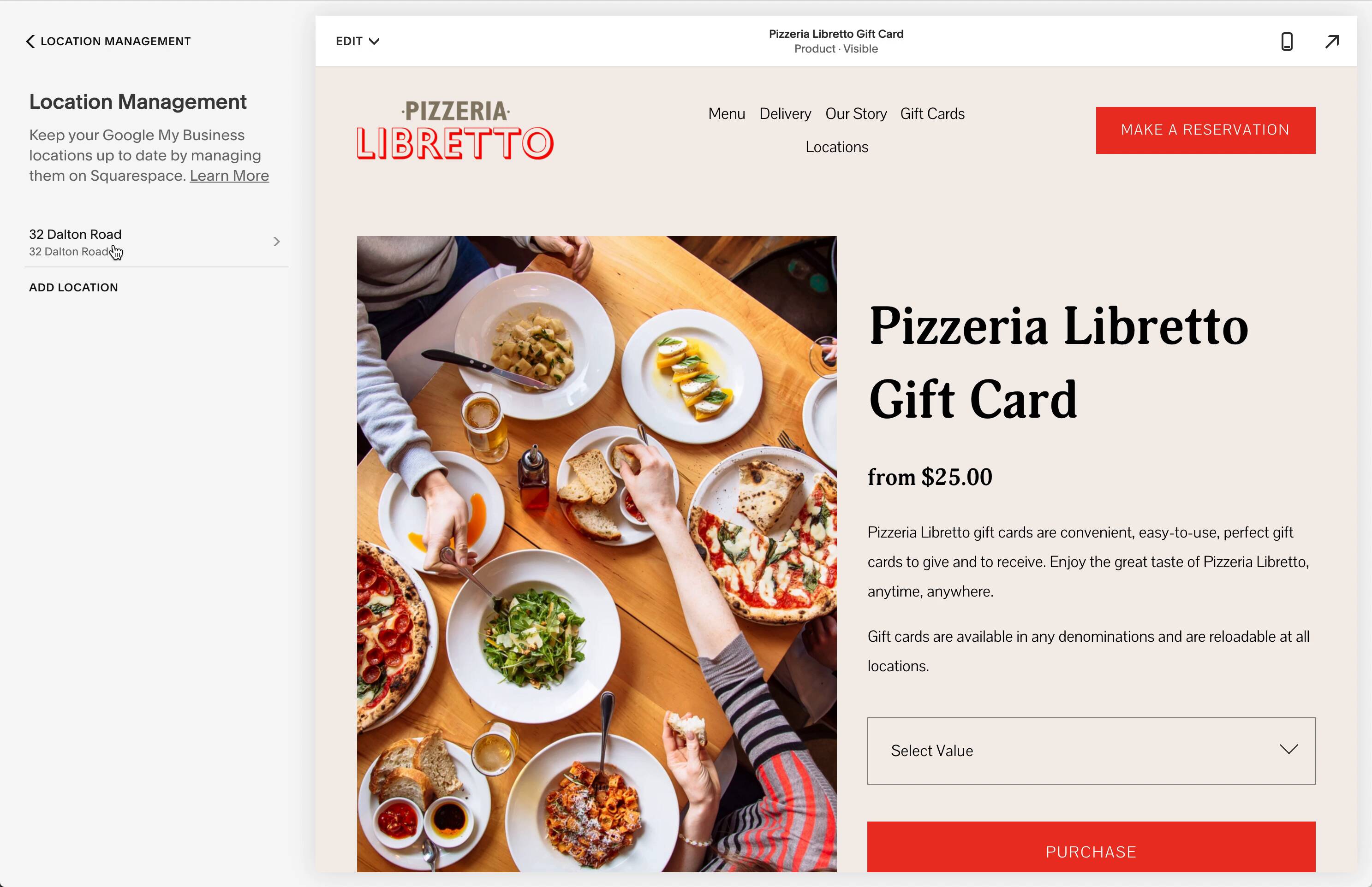
It was actually really easy to sell a gift card product with Squarespace:

Email newsletters are awesome. They are a way for you to have a direct connection to your customers.
For example, remember Le Swan? Well they started selling a picnic basket through their newsletter this summer when Covid kept people from dining in:

Le Swan was able to leverage their mailing list to sell picnic packs when Covid-19 hit.
You could add a signup box to your website but my guess is very few people join a restaurants newsletter from a signup box on the website. Instead it’s probably better to build your list through email receipts or reservation forms.
Just remember to make it opt-in. Don’t automatically subscribe people to your newsletter. In my opinion you won’t gain anything by subscribing someone who doesn’t already want to be subscribed!
The last but very important thing to do is setup Google My Business which will manage how your restaurant displays in Google Maps and Google Search.

Google My Business is where you control how you restaurant displays on Google Maps.
Squarespace has a location management tool that makes this easy. It only takes a few minutes to setup but having control of this is really important.

Setting up locations in Squarespace.
